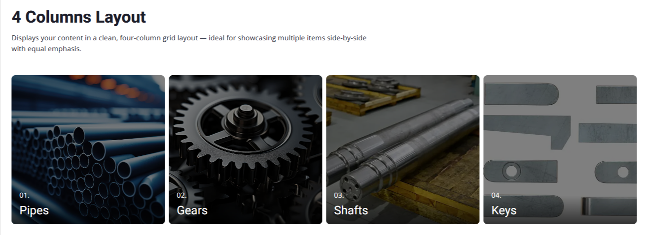
4 Columns Layout
Presents your content in a sleek four-column layout — perfect for displaying several items at once with balanced visibility
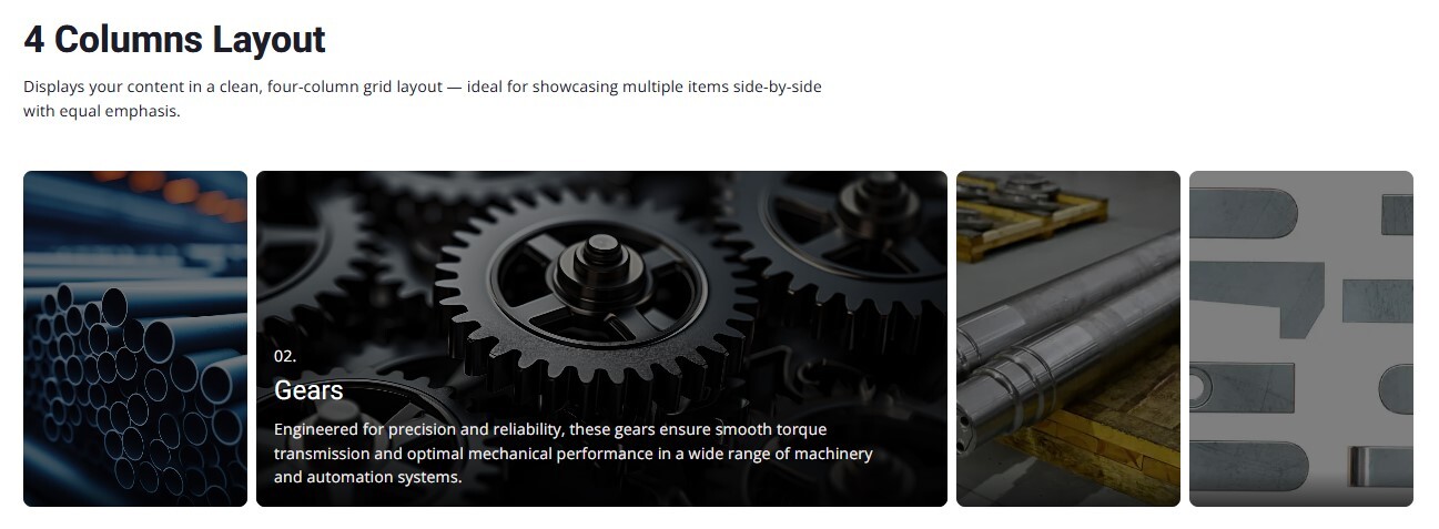
4 Columns Layout while hover
The 4 Columns Layout with Hover effect highlights user interaction by expanding the hovered card's width while shrinking the others. This dynamic resizing draws attention to the active card, revealing more detailed content and making it visually stand out from the rest.
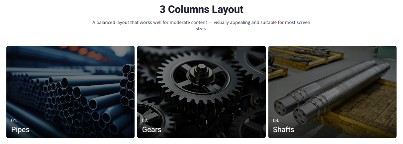
3 Columns Layout
Displays your items in a neat three-column grid, maintaining visual balance and uniform spacing — perfect for showcasing a moderate set of content clearly.
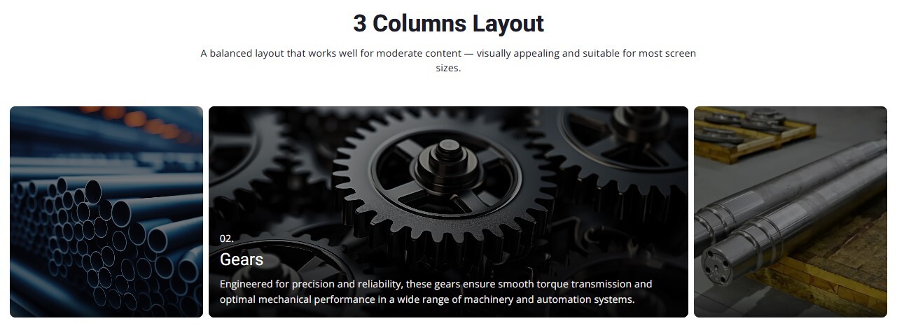
3 Columns Layout while hover
In this layout, hovering over any card smoothly expands its width while the other two contract, making the focused item stand out with added details — ideal for spotlighting key features or visuals without clutter.
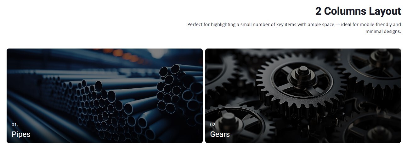
2 Columns Layout
A balanced two-column layout that provides ample space for each item — perfect for showcasing content with larger images or longer descriptions while maintaining a clean and focused design.
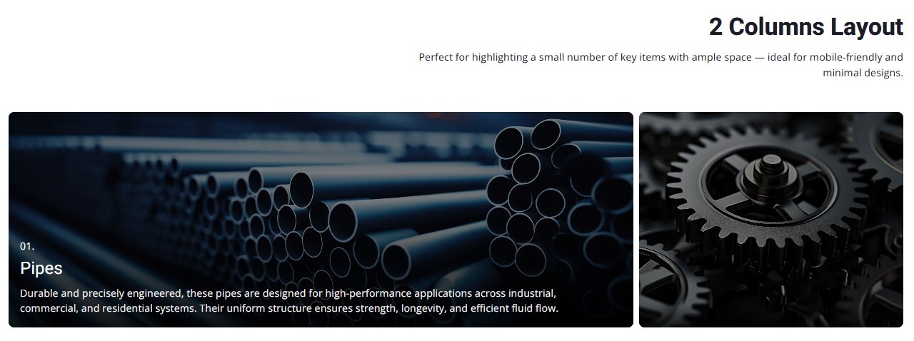
2 Columns Layout while hover
When hovered, one card expands to draw attention while the other contracts, creating a dynamic and engaging visual focus on the selected item. Ideal for presenting detailed content with impact.
2 Columns Layout while hover
When hovered, one card expands to draw attention while the other contracts, creating a dynamic and engaging visual focus on the selected item. Ideal for presenting detailed content with impact.
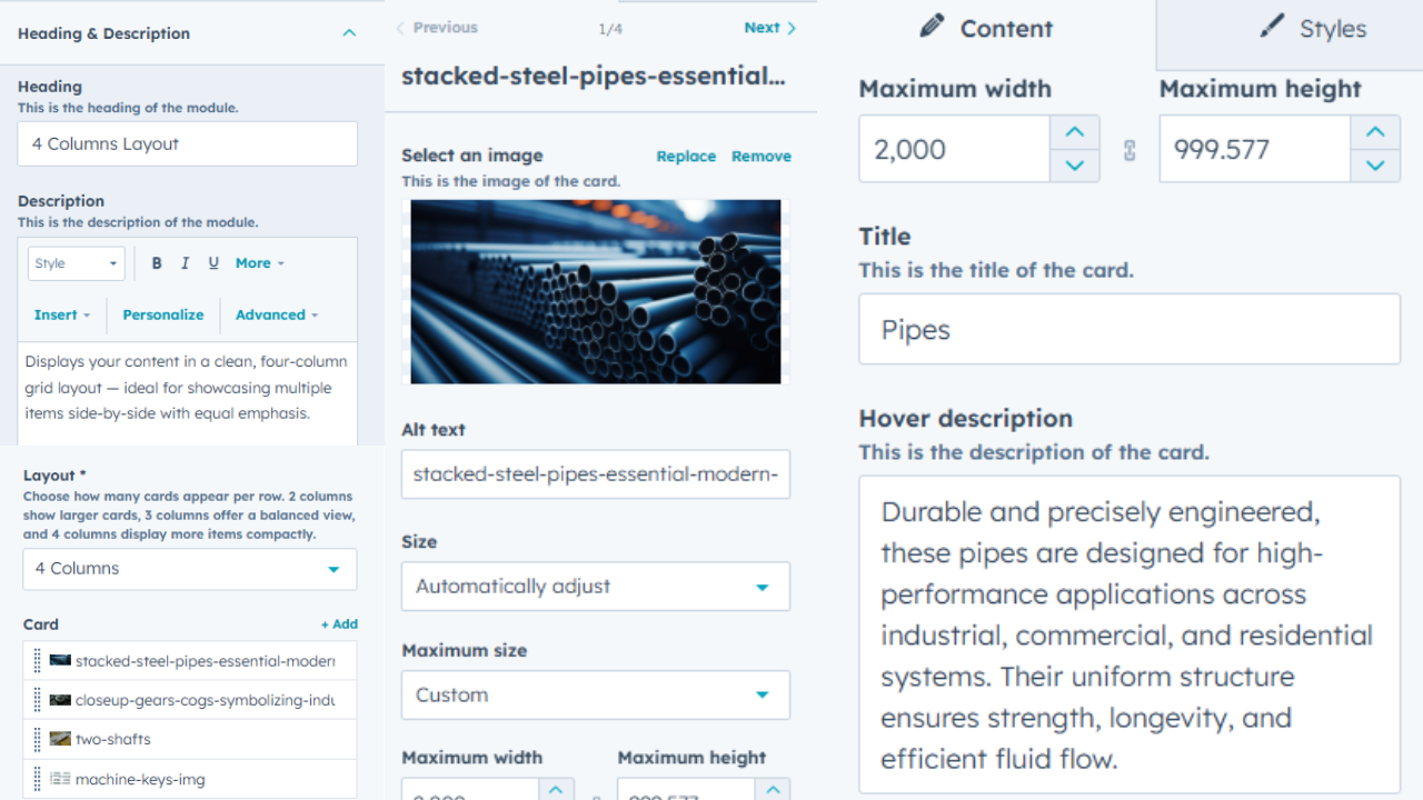
Fully Customizable Content Cards
Easily tailor your module by choosing the layout style, editing headings and descriptions, adding images, setting card sizes, and more. Whether it's a 2-column or 4-column grid, every element is customizable to fit your needs — no coding required.
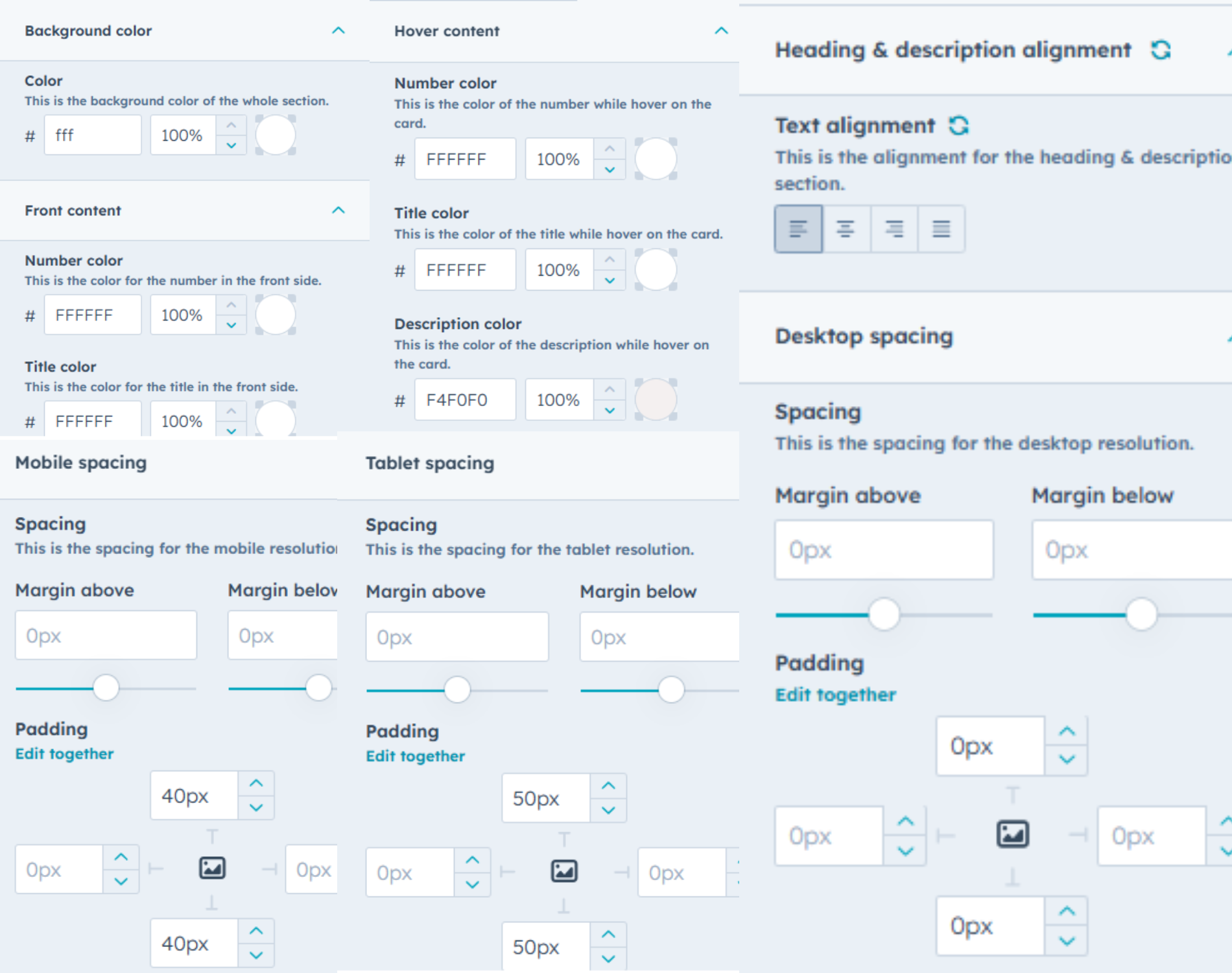
Full Styling Control at Your Fingertips
Easily fine-tune every visual detail — from background and text colors to hover styles and number/title formatting. Adjust alignment, control spacing across mobile, tablet, and desktop views, and maintain full consistency with pixel-level padding and margin controls. Your layout, your style — no limits.