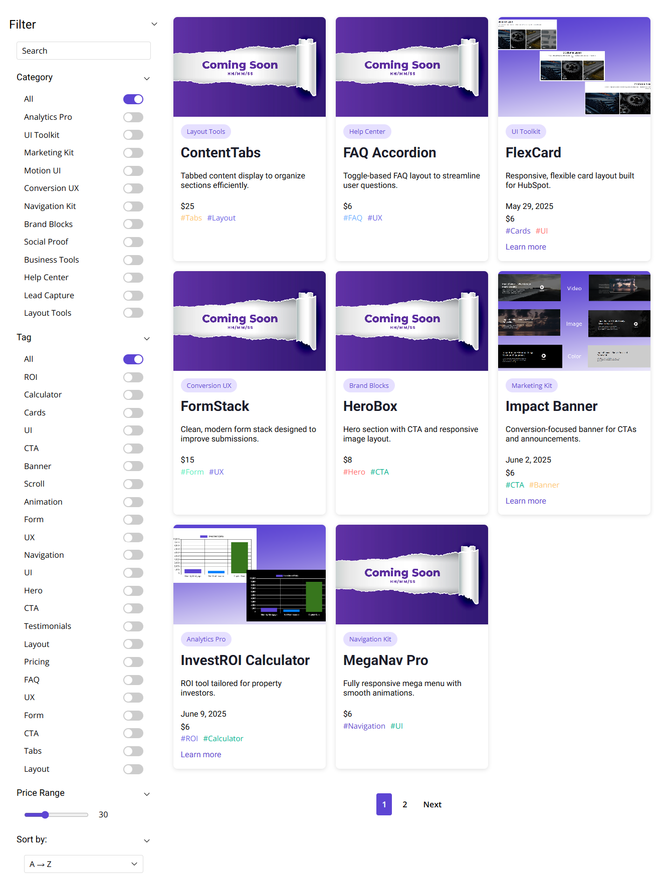
Left Panel Filter Layout
Modern layout with left-side filters and paginated content—built for clarity, speed, and higher engagement.
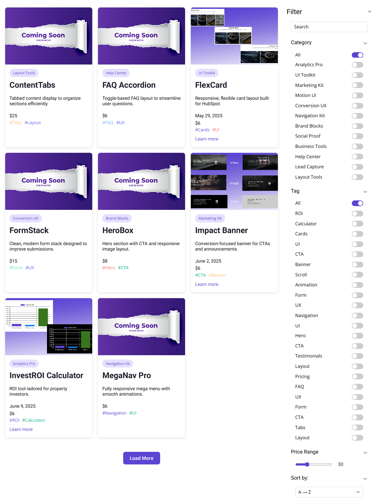
Right Panel Filter Layout
Focused content on the left with filters on the right and a seamless "Load More" experience—crafted for conversion and user flow.
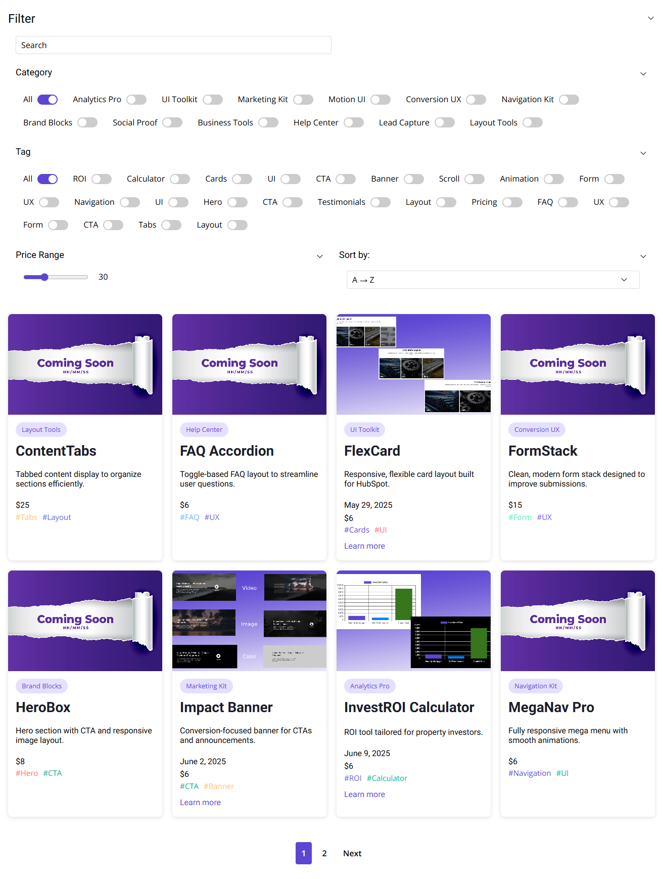
Top Bar Filter Layout
Streamlined top-aligned filters with paginated results below—ideal for fast browsing and intuitive product discovery.
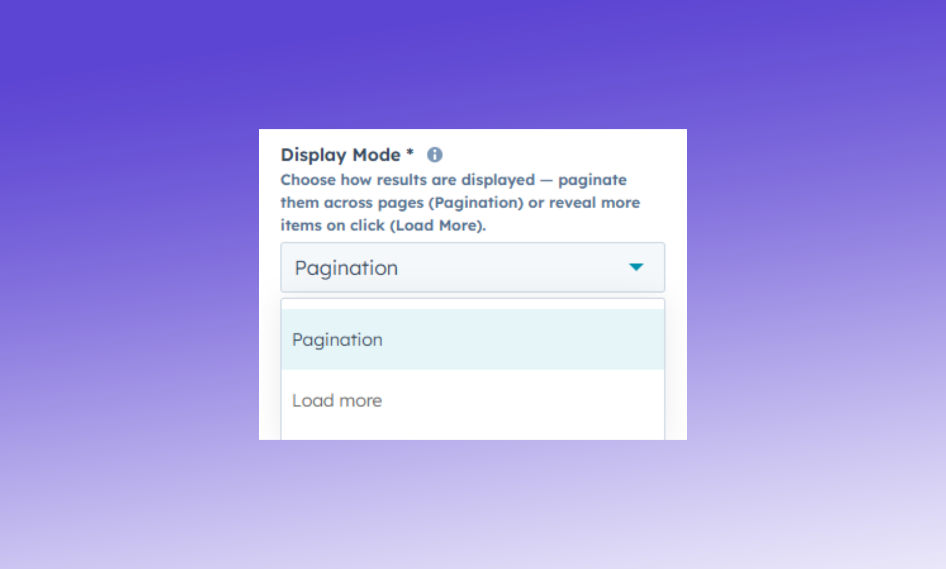
Display Mode
Choose how filtered content is revealed—page-by-page or progressively.
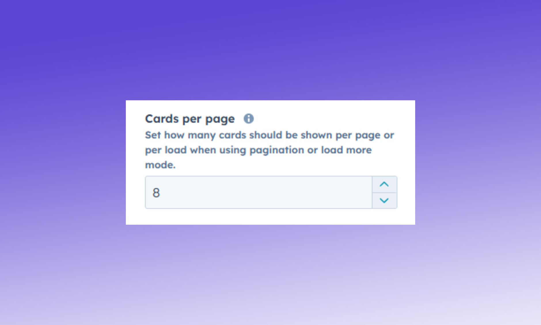
Cards Per Page
Control the number of visible items per view—whether you're using Pagination or Load More. Adjust for optimal layout, speed, and user experience.
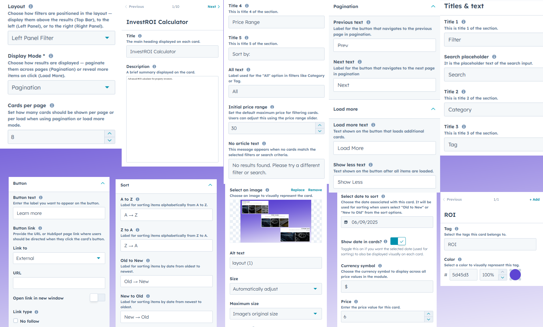
Module Content Settings
Customize layout, display mode, and cards per page. Add title, description, image, price, date, button, categories, and tags for dynamic, filterable cards.
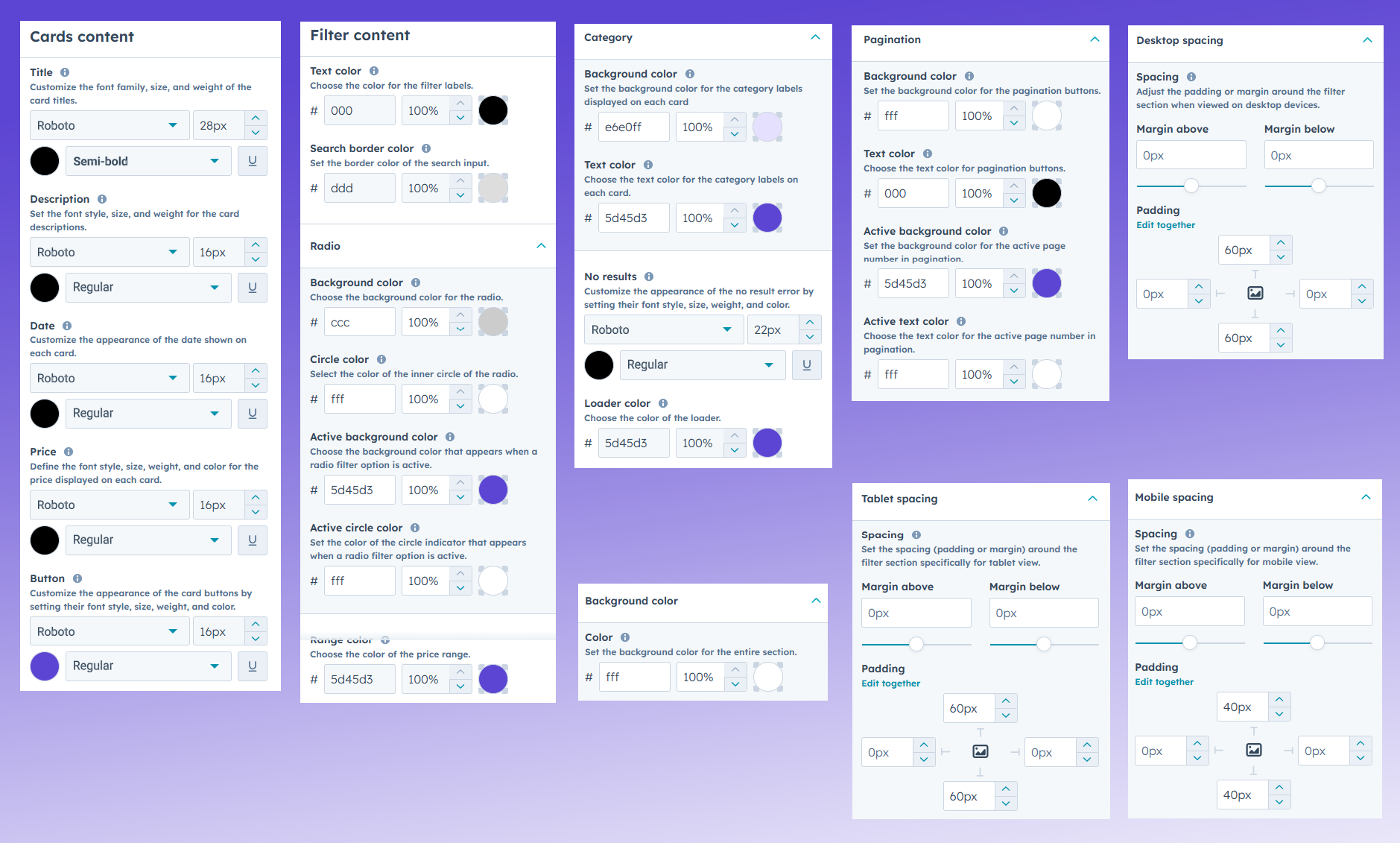
Style & Appearance Settings
Control background colors, spacing (desktop, tablet, mobile), radio & range styles, pagination and load more colors. Customize font styles for title, description, price, date, and button for a polished look.
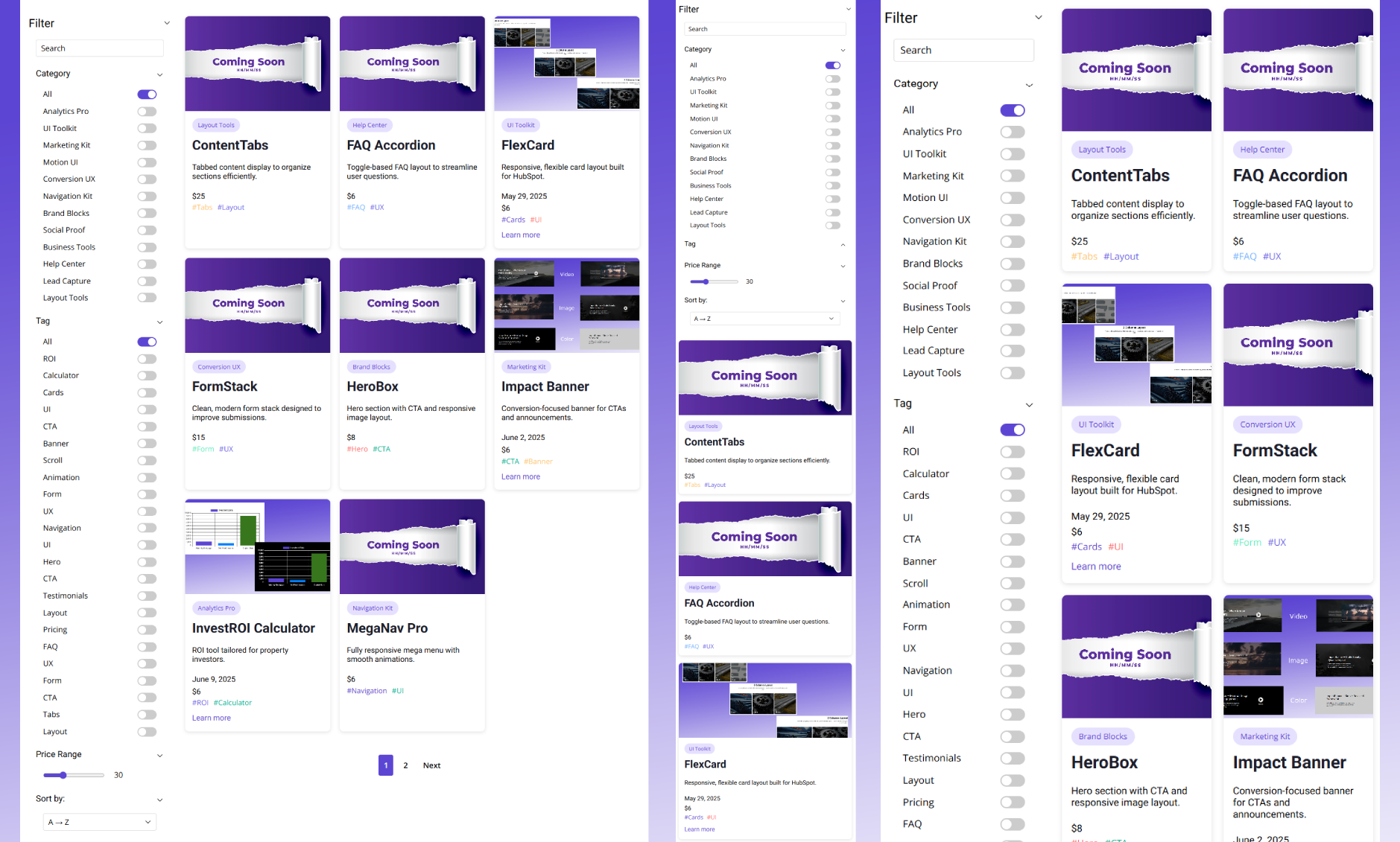
Responsive Layout Preview
Showcases how the module adapts visually across desktop, tablet, and mobile for a consistent and user-friendly experience.